Garnet Theme Documentation
Garnet is a premium digital marketing agency theme. The theme gives you a complete blog, header, footer and brand-color system on its own; the free Garnet Toolkit companion plugin adds the Elementor widgets, content types and one-click demos used to build the full agency site.
Overview
Garnet is delivered as two parts that work together. You can use the theme alone for a blog-and-pages site, or add the plugin to build every layout shown in the live preview.
| Part | What it provides |
|---|---|
| Garnet (theme) | The themed blog (Standard and Grid layouts, archives, search, single posts with comments and post formats), header and footer, the primary / footer / 404 menus, the Blog Sidebar, the Theme Options screen, a brand-color system, block styles and block patterns, and RTL support. |
| Garnet Toolkit (plugin) | 34 Elementor widgets, the Service, Portfolio, Team and Job content types with their archive and detail templates, a Garnet Toolkit settings screen, extra sidebar widgets, single-post share buttons, a newsletter sign-up endpoint, and the one-click demo content. |
Where do I start? Most buyers should install the theme and plugin, import a demo, then replace the text, photos and brand colors with their own. The sections below follow that order.
Requirements
| Requirement | Notes |
|---|---|
| WordPress | 6.4 or newer (tested up to 7.1). |
| PHP | 7.4 or newer. |
| Garnet Toolkit Recommended | Needed for the Elementor widgets, the Service / Portfolio / Team / Job content types and the demo import. Bundled with the theme and offered on activation. |
| Elementor For widgets | Free version, 3.5.0 or newer. Nothing in Garnet needs Elementor Pro. The plugin shows a notice with an install button when it is missing or too old. |
| One Click Demo Import Optional | Only for importing the demo content. |
| Contact Form 7 Optional | Powers the form in the CTA / Contact and Jobs widgets (any form plugin's shortcode also works). |
| Mailchimp for WP Optional | Powers the email sign-up forms in the footer, the Blog Sidebar and the CTA Band widget. |
Every plugin above is optional and none is ever installed or activated without your say-so.
Installation
-
Install the theme
Go to Appearance → Themes → Add New → Upload Theme and choose the theme zip, or extract it into
wp-content/themes/garnetover FTP. Upload the theme zip only, not the whole download package.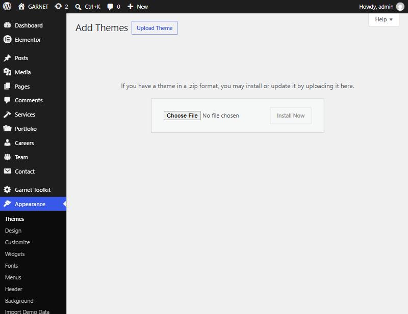
Appearance → Themes → Add New → Upload Theme: choose the theme zip and click Install Now. -
Activate Garnet
Click Activate. The Blog Sidebar is filled with Search, Categories and Tags the first time the theme is activated.
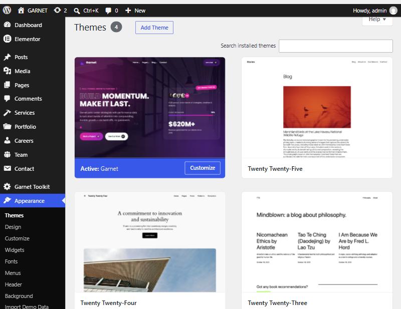
Garnet is first in the list and marked Active. -
Install the recommended plugins
Open Appearance → Install Plugins (or use the notice shown after activation). It offers Garnet Toolkit (bundled — no download needed), Elementor, Contact Form 7, One Click Demo Import and Mailchimp for WP. Pick the ones you want; each is optional.
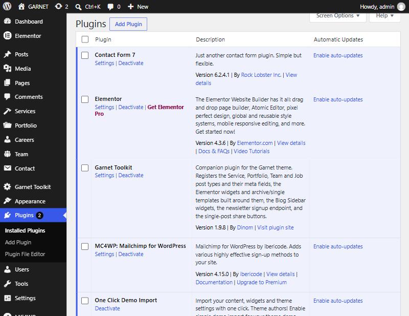
Plugins → Installed Plugins once the recommended plugins are active. -
Import a demo (optional but recommended)
See Importing a Demo. Skip this if you would rather build from scratch.
-
Set your logo, menus and brand colors
Logo and site title in Appearance → Customize → Site Identity; menus in Appearance → Menus; colors, header, footer and blog options in Appearance → Theme Options.
Updating. Install new theme or plugin zips the same way you installed them. To receive updates automatically, install the official Envato Market plugin and connect your Envato account; the theme's License tab can keep a copy of your purchase code, but updates are delivered by Envato Market, not by Garnet.
Importing a Demo
Appearance → Import Demo Data (requires the One Click Demo Import and Garnet Toolkit plugins).
The Garnet Toolkit plugin registers four demos with One Click Demo Import. Each one brings in pages, blog posts, Services, Portfolio, Team and Job entries, menus, the Blog Sidebar widgets and the saved Theme Options. The imported pages are built with Elementor and Garnet Toolkit widgets, so keep both plugins active.
| Demo | Front page it sets | Use it when |
|---|---|---|
| Garnet — Default Home | garnet-home | You want the main homepage layout. |
| Garnet — Basic Home | home-basic | You prefer the lighter hero with the inline stats row. |
| Garnet — Video Home | home-video | You want a looping video background hero. |
| Garnet — Preview Version | garnet-home | You want to browse everything at once: all three homepages and every inner page under one mega-menu. A showcase, not a starting point for a live site. |
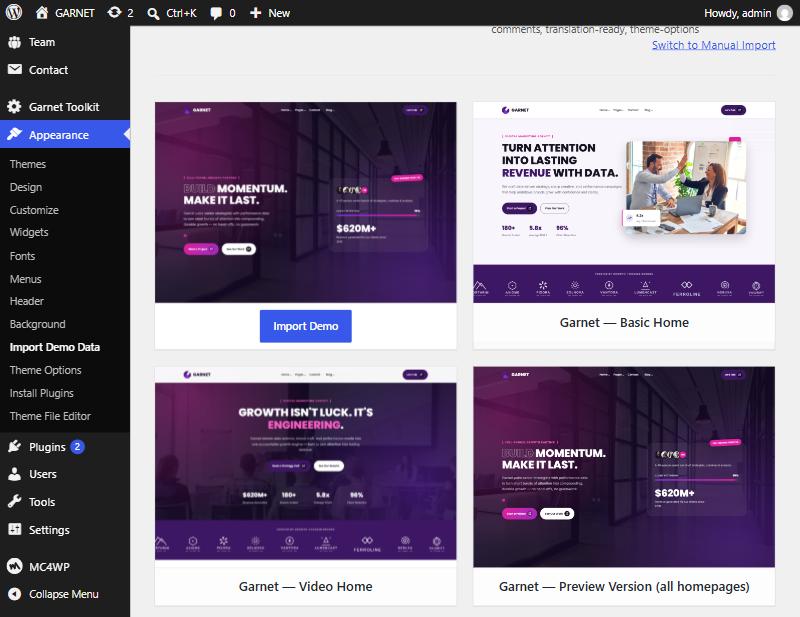
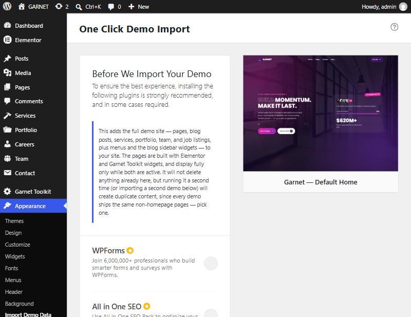
What the import does
- Creates the demo pages, posts, Services, Portfolio items, Team members, Job listings and contact forms.
- Sets the chosen demo page as your static front page and the Blog page as your posts page.
- Creates the demo menus and assigns them to the Primary, Footer Column 2, Footer Column 3 and 404 Page Links locations.
- Fills the Blog Sidebar and applies the demo's footer and blog settings.
- Repairs internal links so they point at your own domain, and clears Elementor's cached CSS so pages render fresh.
Import once, on a fresh site. The import never deletes existing content, but running it a second time — or importing a second demo — creates duplicates, because every demo ships the same inner pages. Pick one demo.
Photos and videos are not included. The stock photography and background videos in the live preview cannot be redistributed. Replace any placeholder images or videos with your own media after the import.
The demo import is only offered while Garnet (or a child theme of Garnet) is the active theme. Importing can take a few minutes on slower hosting; keep the screen open until it reports completion.
Setting Your Homepage
A demo import sets this for you. To do it by hand, build a normal WordPress Page in the Elementor editor from the Garnet Toolkit widgets (or duplicate one of the demo pages), then choose it under Settings → Reading → Your homepage displays → A static page. Set the Posts page to a page named Blog.
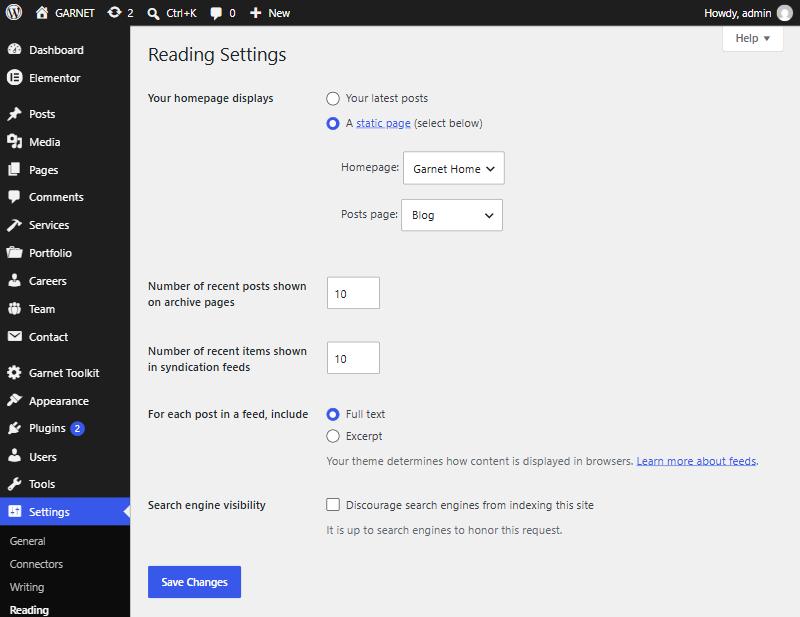
Prefer a running list of your latest posts as the homepage? Choose "Your latest posts". Garnet renders a fully themed blog listing for that case too, using the layout from Blog Settings.
The header can float transparently over a hero on the front page — see Header Settings.
After You Install
A quick checklist for turning the demo into your own site.
Add your brand
Upload a logo (Site Identity), then choose a color scheme or your own Primary and Accent in Color Settings. The whole theme, and every Garnet Toolkit widget, follows it.
Edit the footer and header button
Address, phone, email, social links, copyright and the header's call-to-action button are in Footer and Header settings.
Replace the content
Edit each page in Elementor, and replace the Services, Portfolio, Team and Job entries under their own admin menus. Swap out the placeholder photos.
Connect your forms
Build a form in Contact Form 7 and select it in the CTA / Contact and Jobs widgets. Connect a Mailchimp for WP form under Theme Options → Footer Settings → Newsletter.
Check the menus
Assign menus to the four locations under Appearance → Menus → Manage Locations.
Working with Elementor
With Garnet Toolkit and Elementor active, open any page with Edit with Elementor. The widgets sit in a Garnet Toolkit category at the top of the widget panel; search for "GTK" to find them by name.
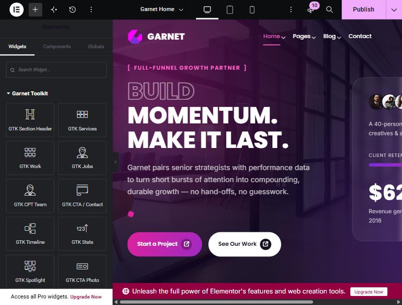
- Section Header controls. Most section widgets start with the same eyebrow / title / subtitle block (with an optional subtitle link) that can be Left, Centered or a two-column Horizontal layout. The standalone GTK Section Header widget gives you the same block on its own.
- Colors follow your brand. Widget color controls are intentionally empty by default so they inherit the palette from Color Settings. Set a color on a widget only when you want to override the brand for that one element.
- Repeaters. Items such as stats, steps, plans, FAQs and perks are Elementor repeaters: add, reorder and duplicate items in the panel.
- Content-driven widgets. Services, Work, CPT Team and Jobs read their entries from the content types; add or reorder entries there (use the Order field in Page Attributes) rather than in the widget.
- Without Elementor. If Elementor is deactivated, pages that were built with it fall back to a standard title plus the page content instead of showing broken markup. Re-activate Elementor to edit them again.
After editing widget code or switching colors you may need to regenerate Elementor's CSS: Elementor → Tools → Regenerate CSS & Data.
Widget Reference
All 34 widgets live in the Garnet Toolkit plugin, in the Garnet Toolkit category of the Elementor panel.
Banners & Heroes
Sections
Content-Driven Reads a content type
Small Building Blocks
Forms & Calls to Action
The Jobs widget's application form works the same way as the CTA / Contact form: pick a Contact Form 7 form or paste a shortcode.
Content Types
Added by Garnet Toolkit — each has its own admin menu, fields and Elementor editing.
All four types support the Order field in Page Attributes, which sets the order cards appear in. Service, Portfolio and Team entries can also be edited with Elementor, so a detail page can be as long and rich as you like.
Services
| Field | What it does |
|---|---|
| Title, Excerpt, Content | Card title and summary, and the detail-page body. |
| Icon | Pick from a visual icon picker. (If Elementor's icon set is unavailable, type a Font Awesome 5 class such as fas fa-bullseye.) |
| Card Color | Cream or Lavender background for the card. |
| Banner Stats | Up to three lines, one per line, as icon-class|Label, e.g. fa-solid fa-arrow-trend-up|5.8x Avg. ROAS. Leave empty to hide the stats row. |
| Featured Image | The detail-page banner background. |
Portfolio
| Field | What it does |
|---|---|
| Year | Shown on the card as "[ 2024 ]" — enter just the year. |
| Tag | A short category label, e.g. "Performance". |
| Portfolio Image | The card image; also the detail banner background. |
| Project Info | Client, Industry, Duration and Client Website, shown in the sidebar. |
| Services Used | One per line, shown in the sidebar. |
For a "results" band on a case study, add a GTK Stats widget with Elementor.
Team
| Field | What it does |
|---|---|
| Role | Job title under the name. |
| Tag (optional) | A short department badge over the photo, e.g. "Design". Empty hides it. |
| Photo | The Featured Image. |
| Location, Joined Garnet In, Email | The Quick Facts in the profile sidebar. Add more as icon-class|Text lines under Additional Quick Facts. |
| LinkedIn URL, X URL | Social links on the profile. |
| Latest From | Link the member to a WordPress user to show that person's latest blog post on the profile. "None" hides it. |
Jobs Admin menu: Careers
| Field | What it does |
|---|---|
| Title, Content | Job title and the full description shown in the job modal. |
| Department, Location | Shown on the open-positions list. |
| Employment Type | Full-Time, Part-Time, Contract or Internship. |
Jobs have no public page of their own: they appear only through the GTK Jobs widget, typically on your Careers page.
Archives & Detail Pages
Services, Portfolio and Team each get an archive (/services/, /portfolio/, /team/) and a single page per entry. You decide how much of it is built by the plugin and how much by you.
Page-first archives
If a published Page exists with the same slug (services, portfolio or team), that Page is shown instead of the plugin's archive — so you can design the listing in Elementor with the GTK Services, Work or CPT Team widget. Delete or unpublish the Page and the plugin's ready-made archive takes over. No permalink refresh is needed either way.
Top bars, sidebars and bottom bars
The ready-made archive and detail templates are assembled from widget areas, so you control them under Appearance → Widgets:
| Area (per content type) | Where it shows | Put here |
|---|---|---|
| Top-bar (Listing) | Top of the archive. | Page Banner Widget — remove it to hide the banner. |
| Bottom-bar (Listing) | Bottom of the archive, full width. | CTA Band Widget. |
| Top-bar (Single) | Top of one entry. | CPT Banner Widget — remove it to hide the banner. |
| Sidebar | Beside one entry. | Anything; when empty, a built-in default sidebar is used (see Sidebar Widgets). |
| Bottom-bar (Single) | Bottom of one entry, full width. | CTA Band Widget. |
That is 15 areas in all: the five above for each of Service, Portfolio and Team. The banner's image and wording are edited in the banner widget itself; the list heading and sidebar side are in Garnet Toolkit Settings.
Garnet Toolkit Settings
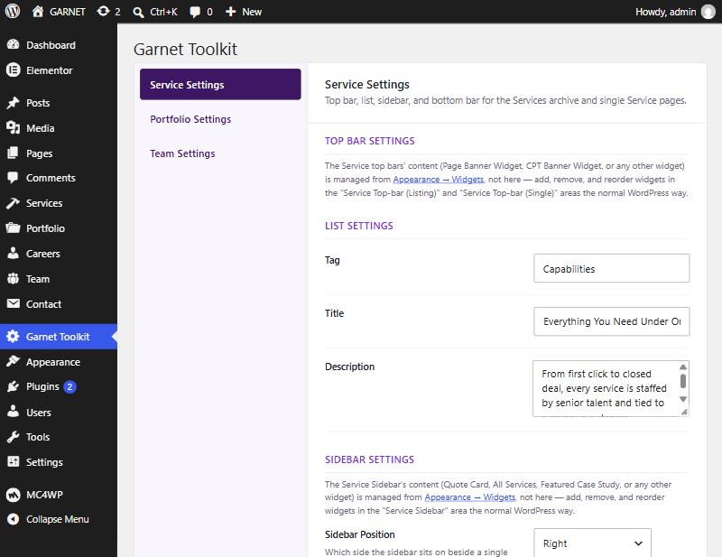
Garnet Toolkit in the admin sidebar — one tab per content type: Service, Portfolio and Team.
Every tab has the same four groups. Text left at its default shows the demo wording, so replace it with your own.
| Group | What it holds |
|---|---|
| Top Bar Settings | A pointer to the two widget areas that hold the banner (Top-bar Listing and Top-bar Single). The banner's image and wording are edited in the Page Banner / CPT Banner widget placed there, under Appearance → Widgets. |
| List Settings | Tag, Title and Description shown above the list of cards on the archive. |
| Sidebar Settings | A pointer to the sidebar area and its default contents, plus Sidebar Position beside a single entry: Right, Left or None. |
| Bottom Bar Settings | A pointer to the two widget areas that hold the CTA band. |
Each tab has its own Save Changes and Reset to Defaults buttons.
Theme Options
Appearance → Theme Options — six tabs.
Each tab saves on its own with Save Changes and, except License, has a Reset to Defaults button that restores that tab only. Defaults match the demo, so saving a tab without changes changes nothing on your site.
Color Settings
The first tab — change the look of the whole site in a few clicks.
Choose a ready-made Color Scheme to set the Primary and Accent colors in one click, then fine-tune below. A live preview updates as you pick.
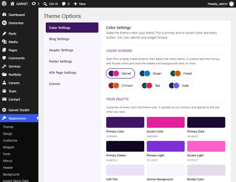
| Group | Colors |
|---|---|
| Brand Colors | Primary (buttons, links, icons, heading accents, dark sections) and Accent (eyebrow labels, highlighted words, small details). |
| Shades | Primary Dark (dark sections, footer, page banners), Primary Darker (image overlays), Primary Light (glows and highlights), Accent Light (accents on dark backgrounds). |
| Backgrounds & Borders | Soft Tint (behind icons, quotes and highlighted blocks), Section Background (alternating sections), Border Color (cards, fields, dividers). |
Auto shades. Everything other than Primary and Accent is worked out from those two, so changing them re-colors the shades, tints and borders too. Each shade shows an Auto note with its current value; pick a color to set it by hand, and use Clear to put it back on Auto.
The same palette is applied to the block editor's color picker and canvas, and to every Garnet Toolkit widget. Photos, the bundled logo and the demo preview images keep their original purple, because they are image files — swap them for your own.
Blog Settings
| Group | Controls |
|---|---|
| Banner Settings | Enable Banner turns the banner on the blog listing (/blog, /blog-standard, /blog-grid) and single posts on or off — a single post keeps its title when the banner is off. Banner Image, Tag, Title and Description set its content. |
| Archive & Search Banner | A background photo for the banner on category, tag, author and date archives and on search results. Empty gives the plain banner. |
| Layout Settings | Blog Layout — Standard (single column) or Grid (card grid) for your Posts page. |
| Sidebar Settings | Sidebar Position for the blog listing/archives/search, and separately for single posts: Right, Left or None. |
The sidebar's contents are managed under Appearance → Widgets — see Widget Areas. Posts per page is a normal WordPress setting (Settings → Reading).
Header Settings
| Setting | Controls |
|---|---|
| Logo & Site Identity | The logo image, site title and tagline are set in Appearance → Customize → Site Identity. Here you set Logo Height (20–120 px; on small screens it never exceeds 56 px) and switch the site title and tagline next to the logo on or off. Without a logo image the theme's default mark shows. |
| Sticky Header | "Smart" (hides while scrolling down, returns on scroll up — the default), "Always visible", or "Not sticky". |
| Transparent Header on the Front Page | Lets the header float over the hero until the page is scrolled. Applies to a front page built with Elementor; other pages always use the solid header. |
| Button | Show or hide the call-to-action button at the right of the header (hidden on small screens), its text, link (defaults to your Contact page; empty hides the button), open-in-new-tab switch, and an optional Font Awesome icon from a visual picker. |
| Navigation | The menu and its dropdowns come from the Primary Menu location (Menus). |
404 Page Settings
| Group | Controls |
|---|---|
| Content | Show the large "404" number and the dotted decoration; Eyebrow Text, Title and Description. |
| Primary Button | Show, text, link and optional icon (default: Back to Home). |
| Secondary Button | Show, text and link (default: Contact Support). An empty link hides the button. |
| Helpful Links | A row of links under the buttons. They come from a menu assigned to the 404 Page Links location; until you assign one, links to Services, About and Blog are shown. |
License
Paste your Envato purchase code here to keep it on file; it is stored where the Envato Market plugin looks for it. Nothing in Garnet is locked behind a purchase code — every feature works with or without one — and updates are delivered through the official Envato Market plugin.
Purchase codes look like xxxxxxxx-xxxx-xxxx-xxxx-xxxxxxxxxxxx; a code in the wrong format is rejected as a typo check. Only the last characters of a saved code are shown afterwards, and saving the field empty removes it. You can download your code from your Envato Downloads page.
Menus
Appearance → Menus → Manage Locations.
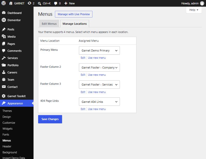
| Location | Where it shows |
|---|---|
| Primary Menu | The header navigation. Menu items with children become dropdowns. |
| Footer Column 2 | The links in the footer's second column. |
| Footer Column 3 | The links in the footer's third column. |
| 404 Page Links | The "Helpful Links" row on the 404 page. |
An unassigned location shows a small reminder linking to Appearance → Menus — only to a signed-in user who can fix it; visitors never see it.
Widget Areas
Appearance → Widgets.
The theme registers the Blog Sidebar, shown beside blog listings, archives, search results and single posts. On first activation it is filled with Search, Categories and Tags; with Garnet Toolkit active it also gets Newsletter and Featured Posts. Add, remove and reorder like in any WordPress sidebar — third-party widgets work too. Where it sits (or whether it shows) is set in Blog Settings.
Garnet Toolkit adds 15 more areas for the Service, Portfolio and Team templates — see Archives & Detail Pages. On the Widgets screen, inactive widgets sit on the left and the live areas are stacked on the right for easier dragging.
Sidebar Widgets
Added by Garnet Toolkit, available in any widget area.
| Widget | Shows |
|---|---|
| GTK: Newsletter | An email sign-up that sends to your Mailchimp for WP form (Footer Settings → Newsletter). |
| GTK: Featured Posts | Every post marked Sticky, as compact cards (the label adapts to how many there are). |
| GTK: Quote Card, All Services, Featured Case Study | The default Service sidebar. |
| GTK: Project Info, Services Used, Quote Card, More Case Studies | The default Portfolio sidebar. Project Info and Services Used read the viewed project automatically. |
| GTK: Member Photo, Quick Facts, Connect, Member's Latest Post | The default Team sidebar. |
| Page Banner, CPT Banner, CTA Band | The top and bottom bars described under Archives & Detail Pages. |
A Service, Portfolio or Team sidebar that is left empty falls back to the defaults above, so a blank area never leaves a gap.
Layouts & Sidebar
Choose Standard (one column, larger cards) or Grid (two-column cards) under Blog Settings; both share the Blog Sidebar. Two page templates — Blog Standard and Blog Grid — always use their own layout, and the demos include pages for both (/blog-standard, /blog-grid) so you can compare.
A post marked Sticky (Quick Edit → Make this post sticky) is pulled out of the main list and shown through the sidebar's Featured Posts widget, so it never appears twice.
Post Formats
Set per post in the block editor: Post sidebar → Format.
Every format otherwise shares the same card and single-post design — only the badge (and the Link format's routing) changes.
Share, Authors & Comments
- Share buttons. Single posts show Facebook, X and LinkedIn share links (a Garnet Toolkit feature). They are plain links and contact those services only when a visitor clicks one.
- Author profiles. Garnet Toolkit adds fields to each user profile (Users → Profile): a local avatar image that replaces Gravatar, and Facebook, LinkedIn, Instagram and X links shown on author boxes. They live in the plugin, so the data stays if you change theme.
- Comments. Standard WordPress threaded comments. Turn them on or off per post in the editor's Discussion panel, or globally under Settings → Discussion.
Block Styles & Patterns
Garnet styles every core block, supports wide and full alignment, and adds a few extras to the block editor that follow your brand colors.
Block style variations
Select a block, then open Styles in the block sidebar.
| Block | Styles added |
|---|---|
| Button | Accent |
| Quote | Minimal |
| Group | Soft Panel, Dark Panel |
| List | Checklist |
| Image | Soft Corners |
Block patterns
In the inserter, open Patterns → Garnet for four text-only starting layouts: Call to Action Banner, Three Features, Testimonial and Intro with Checklist. They contain no photos, so add your own.
The editor uses the theme's fonts and colors, so what you see while writing matches the front end.
Customizing Safely
- Child theme. Make changes to templates and styles in a child theme so a theme update never overwrites them. The demo import and Garnet Toolkit recognize a child theme of Garnet.
- Overriding plugin templates. Copy any file from
garnet-toolkit/templates/into agarnet-toolkit/folder inside your (child) theme, keeping the same relative path, and edit the copy. - Translation. Both the theme (
garnet) and plugin (garnet-toolkit) are translation-ready, with.potfiles in theirlanguagesfolders. Use a tool such as Loco Translate or Poedit. - Right-to-left languages. RTL stylesheets are included and load automatically for RTL languages.
- Brand color in custom CSS. Use the palette variables — for example
var(--gnt-primary)andvar(--gnt-accent)— so your additions follow Color Settings.
FAQ
Do I need any plugins to use Garnet?
No. The blog, pages, archives, search, menus and Theme Options all work with no plugins. You need Garnet Toolkit and Elementor to use the widgets and demo layouts.
Do I need Elementor Pro?
No. The free version of Elementor is enough for every Garnet widget.
Why does the demo look different from the live preview?
The preview's stock photos and background videos cannot be redistributed, so they are not in the download. Replace the placeholders with your own media.
Why don't the contact forms work out of the box?
Garnet ships no mail-handling code. Build a form in Contact Form 7 (or another form plugin) and select it, or paste its shortcode, in the CTA / Contact or Jobs widget.
Why is the newsletter form missing?
Install Mailchimp for WP, create a form, and choose it under Theme Options → Footer Settings → Newsletter. Until then the footer form, Blog Sidebar widget and CTA Band stay hidden.
Why is the Services / Portfolio / Team / Jobs section empty?
Those widgets list entries from Garnet Toolkit's content types. Make sure the plugin is active and add entries under the Services, Portfolio, Team and Careers admin menus.
How do I change the site's colors?
Appearance → Theme Options → Color Settings. Choose a scheme or set Primary and Accent; everything else follows.
How do I change the posts-per-page count?
Settings → Reading → "Blog pages show at most". Garnet does not duplicate this as a theme setting.
Can I use a different page builder?
The widgets are Elementor widgets, so the demo pages need Elementor. The rest of the theme works with the block editor.
Does the plugin send data to third parties?
No. The only outside content is the optional GTK Map widget, which loads a Google Maps embed on pages where you place it and enter an address, and the share links, which contact Facebook, X or LinkedIn only when clicked.
Troubleshooting
The demo import button or screen is missing
Install and activate One Click Demo Import and Garnet Toolkit, and make sure Garnet is the active theme. The screen is under Appearance → Import Demo Data.
The import stalls or times out
Raise your host's PHP limits (max_execution_time of 300+ seconds, memory_limit of 256M or more), then run the import again on a clean site.
Widgets don't appear in Elementor
Confirm Garnet Toolkit is active and Elementor is 3.5.0 or newer. Look in the Garnet Toolkit category at the top of the panel, or search "GTK".
A page looks unstyled or out of date after a change
Regenerate Elementor's files (Elementor → Tools → Regenerate CSS & Data), then clear any caching plugin and your browser cache.
Pages show a title and plain text instead of the design
That page was built with Elementor and Elementor is inactive. Re-activate it under Plugins.
/services/, /portfolio/ or /team/ shows the wrong page or a 404
Check whether a Page with that slug exists: a published Page takes over the URL (see page-first archives). If you recently turned the plugin off and on, visit Settings → Permalinks and click Save to refresh the rewrite rules.
The header shows the wrong navigation menu
Switching themes can remap menu locations. Go to Appearance → Menus → Manage Locations and confirm Primary Menu points at the menu you want.
The footer or sidebar newsletter form is missing
Pick a Mailchimp for WP form under Footer Settings → Newsletter (see the FAQ).
An icon isn't showing
The theme self-hosts Font Awesome 6 for its own icons, while Elementor's icon picker bundles Font Awesome 5; the two sets don't share every icon name. If a picked icon renders blank, choose the nearest equivalent from the picker's search.
Changelog
Garnet theme
1.0.0 — Initial release.
Garnet Toolkit plugin
- 1.9.8 — CTA and Jobs widgets accept a form shortcode from any form plugin; refreshed demo content, settings snapshots and translation template.
- 1.9.7 — Refreshed demo content; updated plugin URI and the demo-media license note.
- 1.9.5 – 1.9.6 — Demo content refreshes (the Portfolio bottom bar gained the More Case Studies grid).
- 1.9.4 — Avatar and author social fields moved here from the theme (values kept); widget stylesheet loads only where needed; the Map widget no longer ships a default address; the demo import updates content through core functions.
- 1.9.2 — Security and coding-standards hardening; added readme.txt.
Credits & Licenses
Bundled as files (not loaded from a CDN at runtime) — each license covers this redistribution:
- Bootstrap 5.2.3MIT License
- Font Awesome Free 6.5.2SIL OFL 1.1 / CC BY 4.0 / MIT
- Owl Carousel 2.3.4 (theme and plugin)MIT License
- Poppins & InterSIL Open Font License 1.1
- TGM Plugin Activation 2.6.1GPL-2.0+
Demo photography and video are for the live preview only and are not included in the download. Brand marks in the demo logo strip are AI-generated placeholders, not real companies or trademarks. The theme and plugin code are released under the GNU General Public License v2 or later.
Support
Before you write in, please check the FAQ and Troubleshooting. For questions not covered here, please submit a support ticket.
When asking for help, include your WordPress, PHP, Garnet and Garnet Toolkit versions, a list of active plugins, and the page URL — it speeds up the answer. Support covers the product as sold; custom code and third-party plugin conflicts are outside its scope.